Every year, when the Pantone of the Year is announced, couples ask the same question:
“How do we use this color in our wedding without making it look predictable?”
A fair question — because the “trend effect” is real. If used without intention, even the most beautiful color quickly feels ordinary.
The good news?
There are smart, modern, and surprisingly elegant ways to incorporate the Pantone of the Year into your wedding design — especially if you’re planning a destination wedding in Italy.
Here is the ultimate guide for couples who want a contemporary, refined, and decidedly non-traditional palette.
1. Start With Glass: The Secret Ingredient of Modern Wedding Design
If there is one material that instantly modernizes any color, it’s glass.
Clean, luminous, timeless — and impossible to overdo. Glass allows the Pantone of the Year (especially a cloud-white tone) to breathe, reflect light, and feel more editorial than “classic bridal”.
Recommended glass elements:
- transparent charger plates
- glass candle holders
- undecorated glassware
- blown-glass vases and compotes
- clear cylindrical votives
What to avoid:
❌ gold — not even a thin rim on a wine glass.
Gold warms the palette immediately and pulls the entire table setting into a more traditional look.
If you want something fresh, minimal, and modern, glass is the answer. Every time.
2. If You Really Want to Use Green… Do It the Unexpected Way
Green is everyone’s first instinct and for that reason, it’s often the least interesting.
Here’s the alternative:
use green as an object, not as foliage.
This single shift changes the entire perception of the palette and makes green feel intentional and contemporary, not a filler.
Modern ways to use green:
- green glassware
- deep-green glass vases
- geometric details in a petrol green tone
- subtle textile accents — not greenery
This approach looks curated, stylish, and editorial.
It’s the kind of detail most weddings don’t dare to use — and that’s exactly why it works.
3. Yes, You Can Use Black in a Wedding (But Only With Clear Rules)
Black is the most misunderstood element in wedding design.
Used badly, it becomes heavy.
Used well, it creates depth, contrast, and effortless sophistication.
But it needs precision.
You can use black only:
✔️ as an accent
✔️ never in large blocks
✔️ only for evening weddings
Where to use black tastefully:
- menu design (a modern favorite)
- cutlery with black handles
- micro-details: thin vases, candle holders, small inserts
- stationery accents: names, lines, seals
Where NOT to use black:
❌ tablecloths
❌ heavy chair frames
❌ floral compositions
❌ daytime ceremonies
Remember:
Black, like white, is not a color — it’s a frame.
And a frame, when used with elegance, makes everything around it feel more modern.
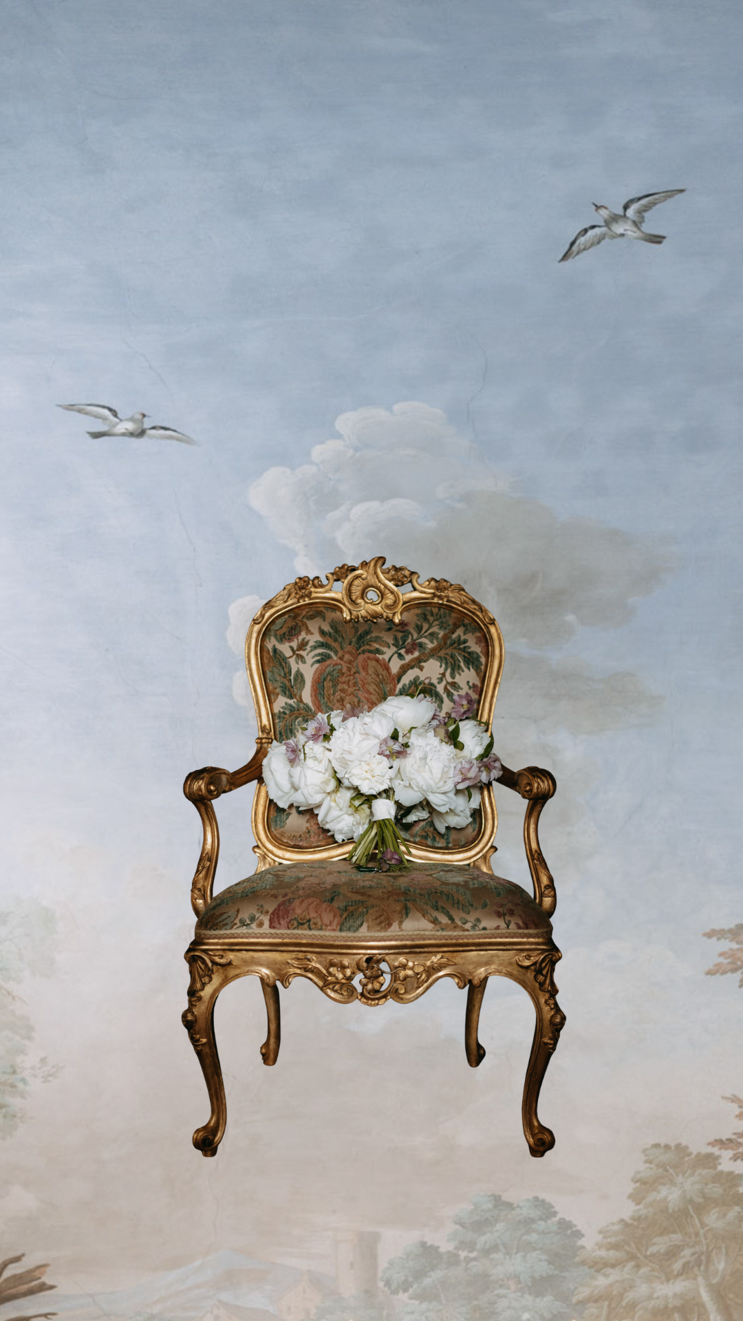
4. The Most Sophisticated Alternative: Layered Whites
If you want a truly contemporary result, there is another technique that works beautifully with the Pantone of the Year:
using multiple whites, not just one.
The “layered white” approach creates depth, dimension, and a visual effect reminiscent of high-fashion editorials.
How to create a modern layered-white palette:
Florals with texture variation:
- cloud peonies
- ranunculus
- sweet peas
- gardenias
- pearly anthurium
Structured textiles:
- silk-white tablecloth
- ice-white napkins
- matte warm-white paper for menus
- translucent paper layers for a cloud effect
Transparent layers:
- glass
- frosted plexi
- semi-opaque candle cylinders
The result is not a traditional “white wedding”.
It’s a living, dimensional, modern white — the perfect companion for the Pantone of the Year.
Final Thought: Balance Is the New Luxury
When working with the Pantone of the Year, the temptation is to use it everywhere. In reality, modernity comes from precision, not abundance.
A subtle accent.
A touch of glass.
A controlled contrast.
A layered texture.
These are the elements that transform a color into a refined design statement — especially in an Italian destination wedding.
Barbara